Communications Campaign and Rebranding of Tokuda Bank AD
-
The churches, caldera and village at Oia, Santorini
Paul Cowan
-
The churches, caldera and village at Oia, Santorini
Paul Cowan
-
The churches, caldera and village at Oia, Santorini
Paul Cowan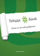
-
The churches, caldera and village at Oia, Santorini
Paul Cowan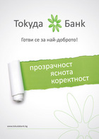


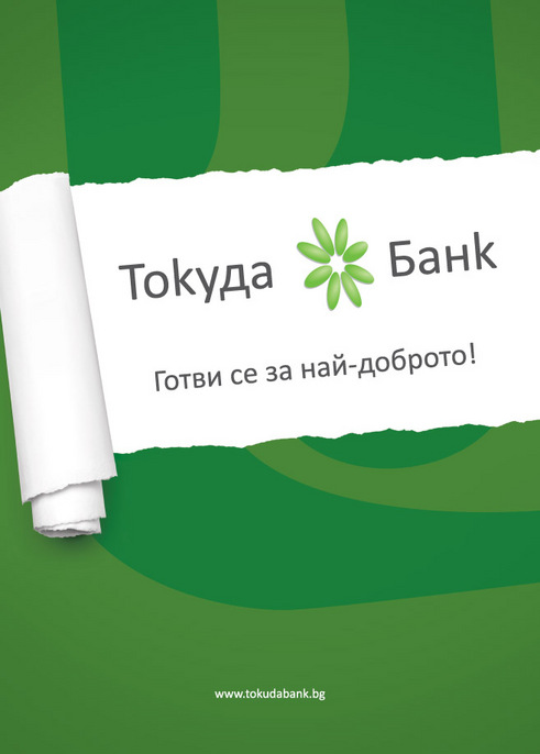
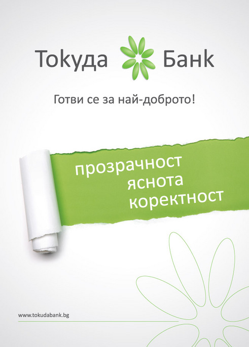
Communications Campaign and Rebranding of Tokuda Bank AD
The work on the communications campaign, focused on the rebranding of Tokuda Bank AD, was given to the team of V-Consulting through a competition.
We took care of the TV and digital advertising, rebranding of the cooperative print materials (business cards, papers, folders, etc.) and created an integrated vision that reflects the new identity of the company.
All the new materials created are united by a styled Japanese chrysanthemum. The green chrysanthemum with eight leaves (“Kiku” in Japanese) is a symbol of longevity and revitalization; the number 8 means prosperity and wealth, and if turned around – eternity. The rebranding marks the new beginning of long-term, correct relationship that the bank has with its clients. The institution relies on correctness, clarity and transparency.
Advertising services, media relations and PR services are some of the projects that our experts will be undertaking for Tokuda Bank AD. For a better and more effective communication between the bank and its partners and clients our team will be creating and maintaining a Facebook page.